

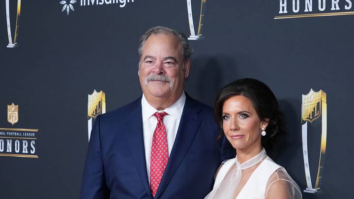
The Houston Texans finally debuted their highly anticipated NFL Rivalries, and the reaction has been resoundingly positive from around the fan base. Along with the release, Texans Chair and CEO Cal McNair gave a reflective statement on the depth of Houston history that went into the design of the new unit.
"We are so proud to finally reveal our Rivalries uniforms," began McNair.
"From the beginning, we charged our team with creating something meaningful for Houston and Texans fans, and they delivered. As a native Houstonian, I know how special the details of this uniform are and we hope our fans will take great pride in the fact that it is so unique to our city."
Literally, every aspect of the uniforms were inspired by one aspect or another of Houston culture, and it manifested itself in one of the most intentional uniform sets the organization has ever produced.
The Houston Texans dove into various aspects of 'H-Town' culture to construct their new Rivalries uniforms
According to the official Texans team website, these are the descriptors that went along with each component to the new uniforms (along with them will come my own take on each):
General description
"Wrapped in Liberty White, H-Town Blue and Battle Red, the uniform combines Houston's signature blue-and-white street tiles, the city's earliest expression of street art, with details inspired by the iconic "Be Someone" bridge and custom car culture."
The "H" logo
"A white variation of the blackletter "H" logo introduced during the Texans' 2024 rebrand."
"Featuring metallic silver, H-Town Blue and Battle Red accents."
Verdict: I was a fan of the alternate "H" logo as soon as it debuted in the 2024 season. The new silver, H-Town Blue and Battle Red variant makes this an incredibly dynamic update on what was already a strong symbol for the team.
The new white helmet
"The team's first-ever Liberty White Helmet pays tribute to the very first helmet prototype held up by late Founder Robert C. McNair in 1999 prior to the team adopting its iconic Deep Steel Blue helmet."
"The helmet features Houston's signature blue and white street tiles that spell out "H-Town" and "Texans" on the helmet's front and back bumpers respectively."
Verdict: Many in the fan base have been clamoring for white helmets for years. What truly makes this amazing aesthetically is the "candy paint inspired finish", which ties directly into the vibrant car scene in Houston. This is a huge win here.
The facemask
"An homage to Houston's car culture, the facemask glistens with a chrome H-Town blue finish."
Verdict: One of my favorite details of the entire uniform, the chrome-finished H-town Blue facemask is an amazing visual touch on the unit. Funny enough, it'll also be a big advantage for NFL referees who might need a little help with seeing a blatant facemask once or twice during a game.
The numbers
"Inspired by Houston's "Be Someone" bridge, a staple piece of H-Town iconography and expression"
"Feature the bridge's unmistakable stenciled block font and are lined with a tiled perforation texture."
Verdict: If you've ever driven down Interstate-45 (I-45 for short) at least once while in Houston, you'd have seen the "Be Someone" bridge. It's a staple in traffic viewing and a motivational phrase for many around the city. Along with it being another chrome finished piece of the uniform, it's another strong reference to the city's culture.
The nameplate
"The jersey's nameplate features a tiled font directly inspired by Houston's iconic blue and white street tiles."
Verdict: An H-Town exclusive, the blue and white tiling show an intimate knowledge of the streets of Houston. Again, another intentional addition to an already strong debut.
The tiled stripes
"The uniform's sleeve, collar, and pant stripes feature Houston's signature blue street tiles lining a beveled two-tone Battle Red stripe with a candy paint finish."
Verdict: The tiling feature has long been rumored throughout the fan base leading up to the official reveal. Some even theorized a University-of-Kentucky-like checkering that would be present down the sides of the uniform. Thankfully, the team utilized the tiling here in a much more tasteful, fulfilling way than just blue and white tile spamming.
Bullhead placement
"For the first time in franchise history, the Texans' Bullhead logo sits over the heart of the jersey in an all-white colorway featuring accents of H-Town Blue and Battle Red."
Verdict: Again, the color variation here bring a refreshing new take on the classic Texans Bullhead logo. Fans will definitely like how this looks under the bright lights of Reliant Stadium.
Houston/Us inner collar
"The inside of the jersey's collar features a Battle Red "Houston" wordmark in the distinct "Be Someone" bridge font featuring the word "Us" highlighted in H-Town Blue."
Verdict: Representing the strong sense of community in Houston, this is a great finishing touch to the love letter that was the NFL Rivalries uniform for the Texans. This truly puts a bow on what seemed like an organizational effort to blend together both the rich history of the city of Houston and they're ambitious drive for the future of the team.
Rivalries merchandise will go on sale on Tuesday, Sept. 1 on Fanatics.com and will be available at the Houston Texans Team Shop from 9 a.m. – 8 p.m..
 Add us as a preferred source on Google