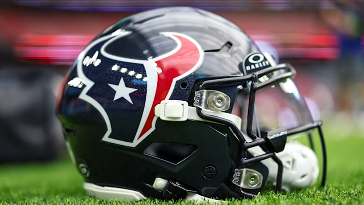
What a saga this Texans uniform reveal thing has been. Houston's new threads were teased for much of last season, and considering it was the first real chance for a rebrand in the team's history, there was a ton of anticipation about what direction they would take it, how dramatic it would be, etc.
Then, like they always do, mockups leaked on Reddit. The reaction was ... let's call it underwhelming. But optimists held out some hope that it was simply a weird Walmart fake, because that's exactly what it looked like. Little did they know at the time that, no, that was exactly what the new jerseys looked like, because apparently every NFL today is obsessed with the idea of looking like The Frankfurt Galaxy.
But this week, the Texans finally released the entire slate of their new uniforms. You should be warned: there is quite a bit going on here.
A new look in Houston 🤘#HTownMade pic.twitter.com/3dnAUl60YX
— Houston Texans (@HoustonTexans) April 23, 2024
Grading the Texans new helmet and uniform combos for 2024 season
1. Modern Meets Tradition
Grade: B+
Modern meets tradition 🤝 pic.twitter.com/xW3D5QChn5
— Houston Texans (@HoustonTexans) April 23, 2024
These are the safest ones of the group, and for good reason. It's hard to move too far away from your "iconic" home jerseys unless you're pulling a full rebrand, and the Texans were smart enough to know that people still wanted the classic blues around. There's not a whole lot different about this one, except for the fact that the numbers are kinda curvy now; they really went out on a limb here. They get an B+ for not over-fixing something that wasn't broken.
2. Ice bright as a neon light
Grade: C-
Ice bright as a neon light ❄️ pic.twitter.com/xUckVfYmpv
— Houston Texans (@HoustonTexans) April 23, 2024
If it's not a swing and a miss, it's a pop fly that gets caught behind home plate for the third out of an inning. There was probably an argument to be made that the Texans' white uniforms were pretty boring, but aren't they all? Only like, a dozen teams actually pull off white jerseys well, and not just because they're mandated to. Swapping number colors – the last version was block red with a thin blue outline – makes them look cheaper, and the shoulder horn thing doesn't entirely work the way they want it to. Maybe they'll look better on TV, but this look feels like they couldn't decide whether to totally overhaul the white jerseys or keep them exactly the same, but ended up in a weird middle ground that's even worse.
3. Bold for the battle
Grade: A-
Bold for the battle 🔴 pic.twitter.com/2yOAWRoYVO
— Houston Texans (@HoustonTexans) April 23, 2024
The Texans' all-reds have always been the beloved-underground-band of Houston's uniform set, so it's nice to see that the team didn't abandon them when they had the chance. Admittedly, they're pretty loud, but it works for a team that plays in *Texas* and they look fine on TV. Credit to them for taking a big swing on a new helmet – with their logo, it always felt like the Texans were destined to have that style of helmet eventually. The red chrome is nice, but it'll be interesting to see how well the blue horns pop – they're kinda hard to see in these pics. Either way, these will be easy to mix and match with, and the Texans have a Thursday Night Color Rush uni that doesn't feel forced.
4. Ice so blue
Grade: C+
Ice so blue 🥶 pic.twitter.com/3nC5xglb6x
— Houston Texans (@HoustonTexans) April 23, 2024
In an era where every uniform rebrand is obsessively focused on minimalism, the Texans deserve some credit for taking a big ol' leap of faith in the other direction. An entirely new helmet logo is a cool idea in theory, but Houston doesn't really pull it off here, and the final result looks way too much like one of the preset team logos you can make in Madden. The good news? The Texans might have something with the light blue outlined, red-eyed bull logo, and these sets look so much better when paired with red socks and blue gloves. I could see these aging well, but it's going to be super confusing if they ever wear them against the Titans.
